English |
简体 |
繁體
Sign Up Now | Log In | Help | Add favorite | Expo-Sourcing
What role does typology play on packaging for building a brand? How decisive is typography for the success of a product? Which are the specific technical challenges associated with packaging printing? These were the questions addressed at the “Leipziger Typotage”.
Designers’ needs met here with printers’ wishes and the latest trends in the international packaging arena. To the tune of 90 design and printing experts attended the “Leipzig Typo-Days” organised by the “Gesellschaft zur Förderung der Druckkunst Leipzig e.V.” on 16 May this year. Product managers, renowned designers, brand gurus and scientists formed a hands-on platform revolving around the function and effect of type on packaging.
Anything goes?
Prof. Dr. Ulrike Herzau-Gerhardt of the Leipzig University of Technology, Ecomony and Culture, elaborated on the purpose of packaging and the impact of design in view of its role as a communication tool. A basic requirement for packaging prints: the creative typographic design of a layout must always also take the technical realisation on various packaging substrates into consideration. As a result the currently available printing processes must also be assessed in view of their suitability for packaging printing. They offer entirely different possibilities for reproducing such graphic elements as lettering, image and graphics. Furthermore, all printing methods have their benefits and drawbacks on different packaging materials – and also come up against their limits.
How important is typography?
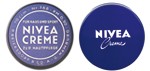
What is the importance of lettering? How important is it really? Armin Angerer, Managing Director at the Peter Schmidt Group in charge of the Product Branding & Packaging Division, raised the question of the function served by typograhy. Besides the shape, colour and visuals it is one of the main components of distinct packaging. However, what is the contribution made by letters to the popularity of such famous packaging as Coca Cola, Nivea or Maggi? One thing is for sure: lettering on packaging can make or break a brand, describe the product, inform consumers about product use and benefits, distinguish among different sorts, indicate ingredients and components, contain handling instructions, safety advice and consumer information as well as indications as to product origin.
Typography makes brands globally consistent
The importance of typography for building a global brand was explained by Horst Rühle, the former Head of Corporate Identity at Beiersdorf AG. In his view lettering must first and foremost be a carrier of information and trigger associations. This way it conveys the product’s image, generates high recognition levels thereby ensuring popularity. Furthermore, it is a design element that must be easily legible, stand out from the competition, reflect a concept and be in line with the zeitgeist. Therefore, it must be seen in conjunction with all the other design elements of packaging and the brand concept focusing all the functions of packaging in one. All elements of a brand must interact with the typography. Lettering puts the entire concept in a nutshell. Different fonts on one product must be harmoniously arranged and show a clear hierarchy in terms of their functions. Typography is caught somewhere between continuity and modernity. Examples like Nivea, Hansaplast or Tesa show how a brand remains modern and consistent around the globe with continuous little steps or fundamental changes.
Foreign countries, foreign logotype
How different cultures and markets handle typography on packaging and what their priorities are was demonstrated by Julius Wiedemann, Taschen Verlag, Cologne, in his talk. In his view the variables of packaging and their success include visuals, logos, information, colour, material, placement at the PoS, marketing and the packaging shape. This is where many forces clash: e.g. the simplicity versus the complexity of packaging, its beauty, the attention it wants to grab, its brand heritage, the necessity or rather requirement to provide information, creative design freedom, accountancy for costs and control of results.
Questions must also be asked in view of aesthetic aspects: What are the designers after? What counts for retailers? What do consumers want? What needs to be communicated? And in terms of information the question runs: What legislation needs to be complied with? What is important to shoppers and what to retailers? What takes images to be explained? What is key for consumers? What decides sales? And what do designers place emphasis on? On top of this the current trends in the most important markets around the globe also differ. Hence – a major challenge for the brands that want to score international success.
The event also focused on other aspects such as the impact of typography on human organs of perception and the impact typographic design has on the product quality to be expected. The next “Leipziger Typotage” will be held on 8 May 2010.
Tel:886-2-28941823 Fax:886-2-28941837 E-mail:viya@packsourcing.com
Copyright Notice © 2015 New Insight Publishing Ltd.. All rights reserved.
Powered by Packsourcing
